User-friendly dashboards constitute a basic aid in decision-making. Data-driven businesses leverage clear and interactive dashboards to make life easier for staff and management.
Efficient dashboards communicate information at a glance, enabling users to quickly extract actionable insights, address urgent tasks, identify trends and patterns, and most importantly, find improvement opportunities. Configuring NetSuite dashboards is essential in the implementation stage but it is a practice that should continue well after the Go-Live. Drawing attention to critical items that need to be actioned is one of the overriding objectives of customising dashboards, facilitating your end-users to see information in a meaningful and memorable way. Highlighting Saved Searches plays a crucial role in this visualisation process. Considering that Saved Searches can take up around 90%of the real estate space within NetSuite dashboards, you might find this topic helpful. Below are 3 techniques that you can use to build visually compelling dashboards that improve end-user engagement and ultimately increase your operating potential.1. Highlighting saved search detail results.
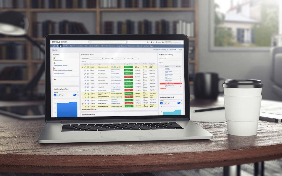
For this example, we will create a saved search filtered to show only open cases.
In the Results tab > Columns subtab, we set the following fields to display in the saved search results.

Under the Highlighting tab > Highlight if… subtab, we will select to use black text colour on yellow background with bold font if the customer is High Impact. We will set a different rule to display a red flag with bold font if Priority is set to S1-High.

The image below shows how highlighting within the saved search helps identify high impact and priority cases quicker.


2. Highlighting saved search summary results.
For this example, we will create again a saved search filtered to show only open cases.
In the Results tab > Columns subtab, we will set some fields to be displayed and summarised: Company (Group), Date Created (Minimum), Date Created (Maximum), and Internal ID (Count).

Under the Highlighting tab > Highlight if… (Summary) subtab, we will set to use white text colour on red background with bold font if the “Count of Internal ID” is greater than 3.

The image below shows how highlighting summaries can help users quickly identify companies with more than three open cases.

3. Highlighting single cells based on criteria.
For this example, we will use the saved search that we used in the first example above, including the highlights configured for High Impact and Priority cases.
In the Results tab > Columns subtab, we will set some fields to be displayed. Notice the addition of a Formula (Text) field that uses SQL formula with HTML formatting. This example will show “Within SLA “ with a green background when the Case Date Created is less than 30 days. It will also display “>30 Days ⚠” with a red background when the Case Date Created is greater than 30 days.

The image below shows how highlighting single cells within the saved search summary results can help users quickly identify cases that have exceeded the SLA target.

Keep evolving your dashboards.
There are many more use cases around highlighting detail results, summary results or using formula fields to highlight results in detail and summary views. These are but three examples to get you started and inspired to keep making updates and improvements. Our final piece of advice is the most important. Once you have built your dashboard, don’t just leave it. Ask your team for feedback. Use their feedback to iterate your dashboard. Check your dashboard is driving the behaviour you intended. Step back from your board every now and then and look at how the elements are working together. Remind yourself what information you’re trying to highlight and how effectively those essential elements stand out. Let us end this article by showing you a dashboard without highlighting vs. a dashboard with highlighting. Which one do you think helps your staff to be more efficient?Dashboard without highlighting

Dashboard with highlighting

Klugo specialise in user-friendly implementations optimised to achieve operational excellence. We can ensure that your dashboards are always up to date, making your team’s life easier.
Schedule a call with us today to learn more about improving NetSuite user experience and how we can assist your data-driven strategies.
About Klugo
NetSuite + NextService
Klugo’s vision is to unlock the full operating potential of our customers to maximise the value of their business. We do this by helping our customers achieve operating excellence using NetSuite + NextService, the world-leading cloud ERP and FSM business platform for small-to-medium-sized businesses.
Need a specialist’s free advice?
Feel free to call an expert in operational excellence today. Find out how cloud-based technology can support and quickly adapt to your growth strategies.